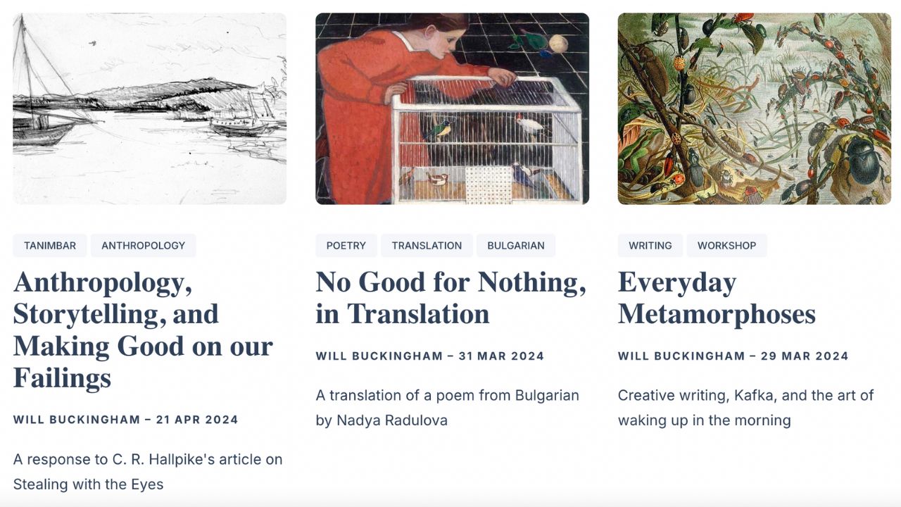
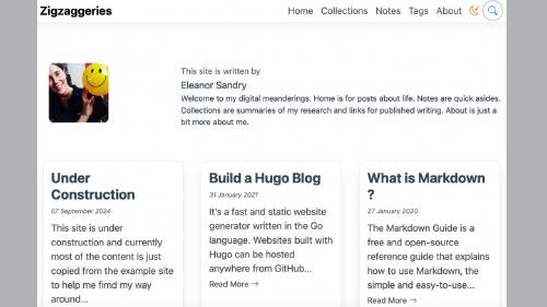
While I know there are lots of sites around the web that are styled using a card type layout, I think that I was probably most influenced by Will Buckingham’s blog…
I love Will’s writing (books and online), so I visit his website and the associated blog pretty regularly when prompted about a new post via the RSS feed in Feedly. I always admire the way the site looks (the image for this post shows a screenshot), but now, while trying to implement something similar for myself, I wonder if image choice will sometimes hold me back from writing at all.
This form of presentation is familiar to me as a reader, but not as a writer, and I’m also still not sure how well I’ll get on with the rather image-heavy look and feel up front, before what might be quite a substantial piece of writing behind (once you click through).
My old site was what I think of as a “traditional” blog. The home page was straight into the reverse chronological feed of full posts, not a sort of visual summary page of the type I’m trialling here. I do have the option to use that type of theme here too (there are a few Hugo themes that support that style). I wonder if more traditional will encourage me to write more… or less. With the web now being very reliant on images to gain attention, even for people that you are hoping will primarily become readers of text, I thought that the card-style theme would work well.
To be honest, I think I was also trying to push myself out of my comfort zone, or at the very least make a definitive move away from the way that the old Zigzaggery used to look.
What do you think?
You can leave a comment below or you can chat with me on Mastodon instead, if that’s possible for you.


